THE CLIENT
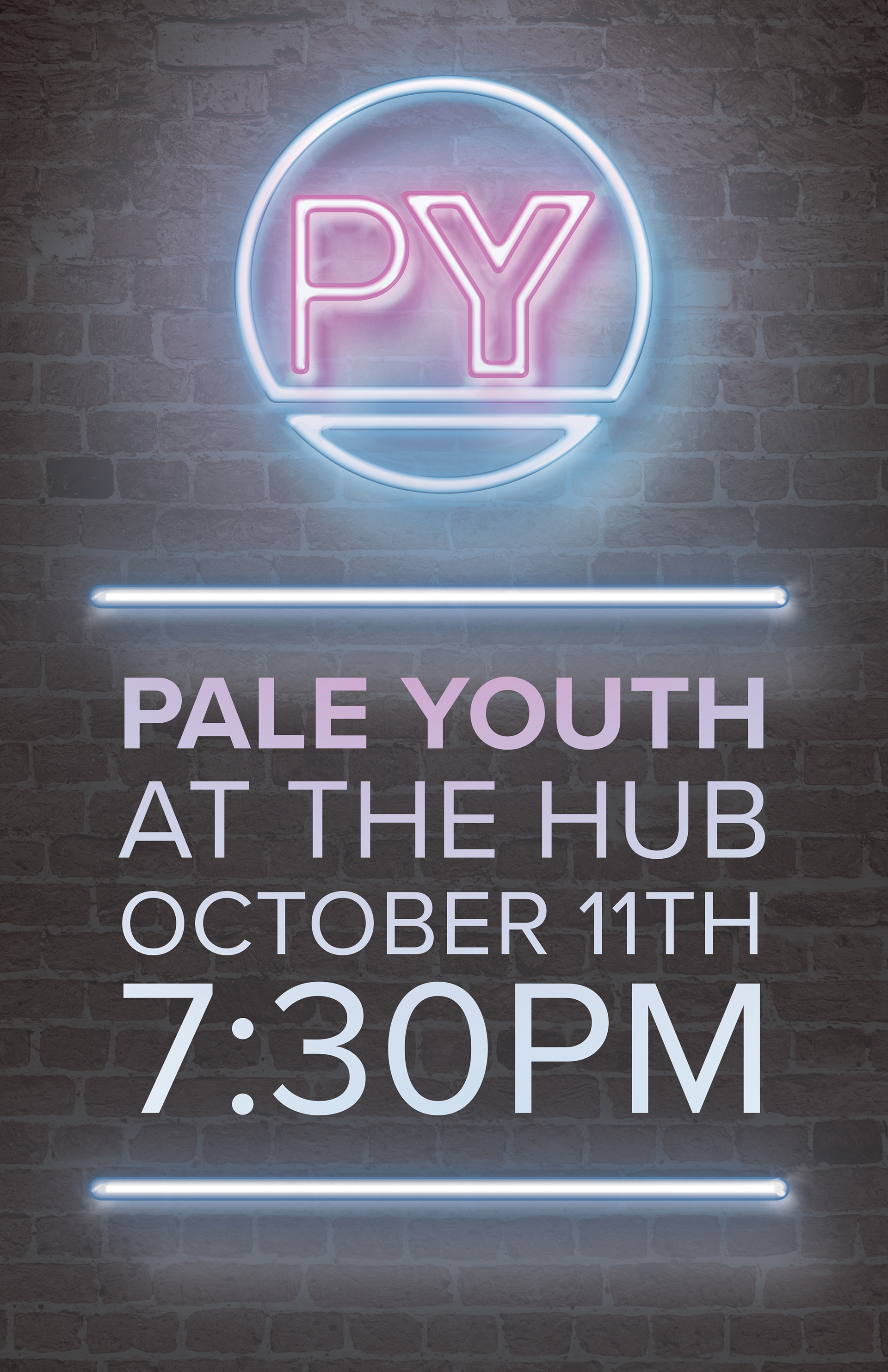
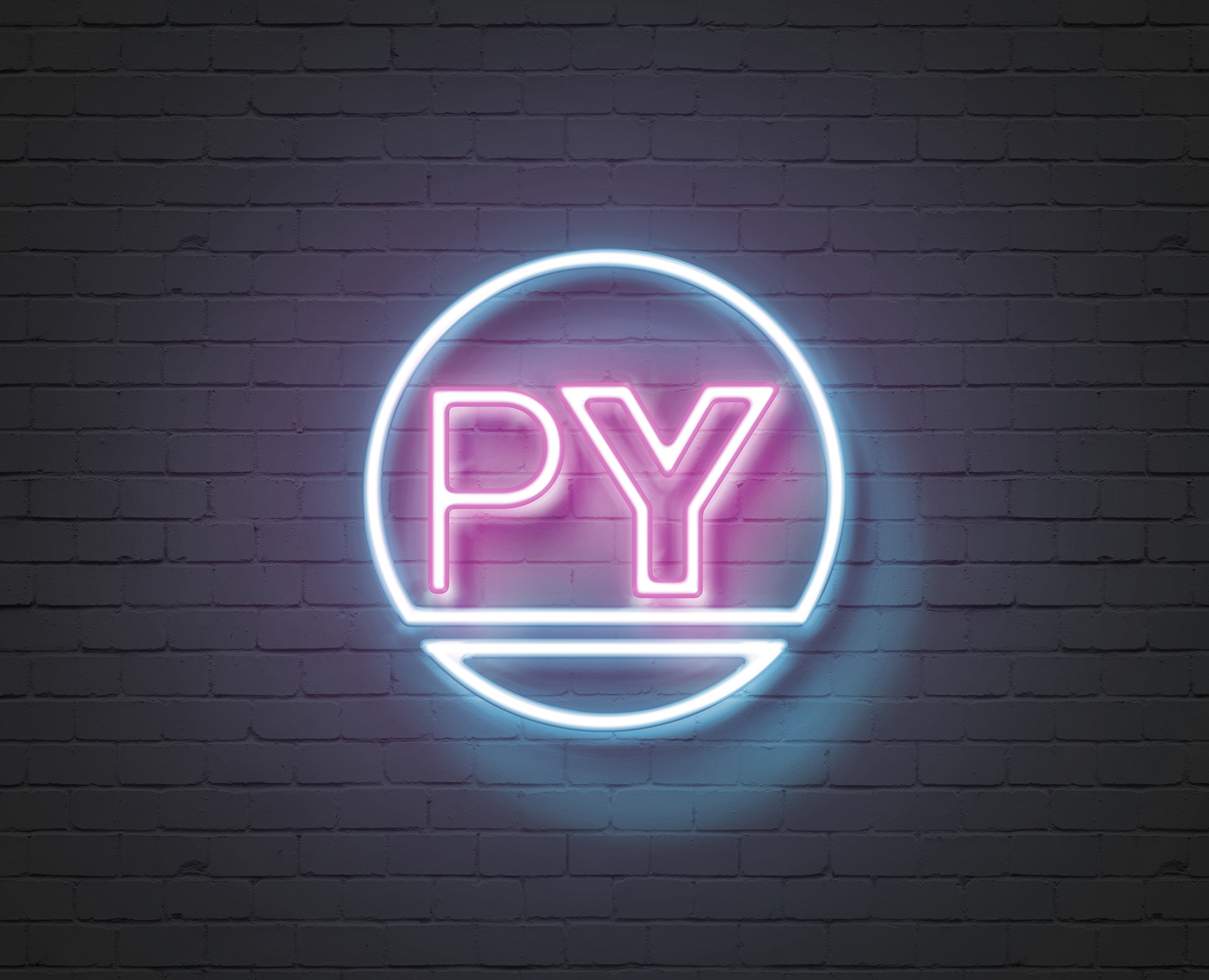
Pale Youth // Nashville, TN
THE ASSIGNMENT
After being approached by a band being born out of Nashville, I was tasked with creating a simple, modern, but also 80's inspired logo. It was not easy, to say the least.
THE PROCESS
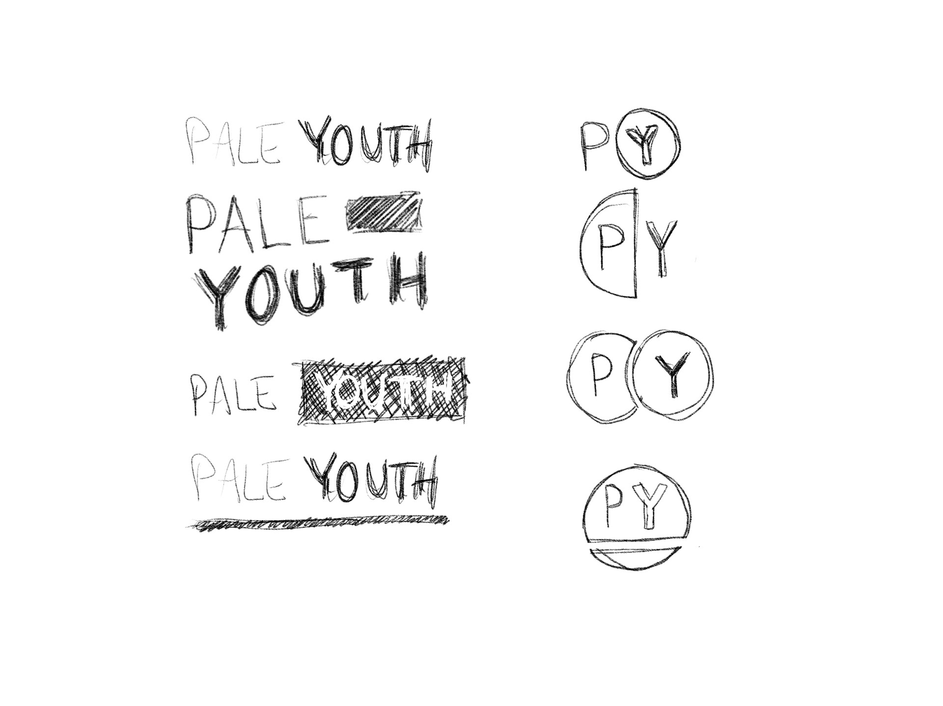
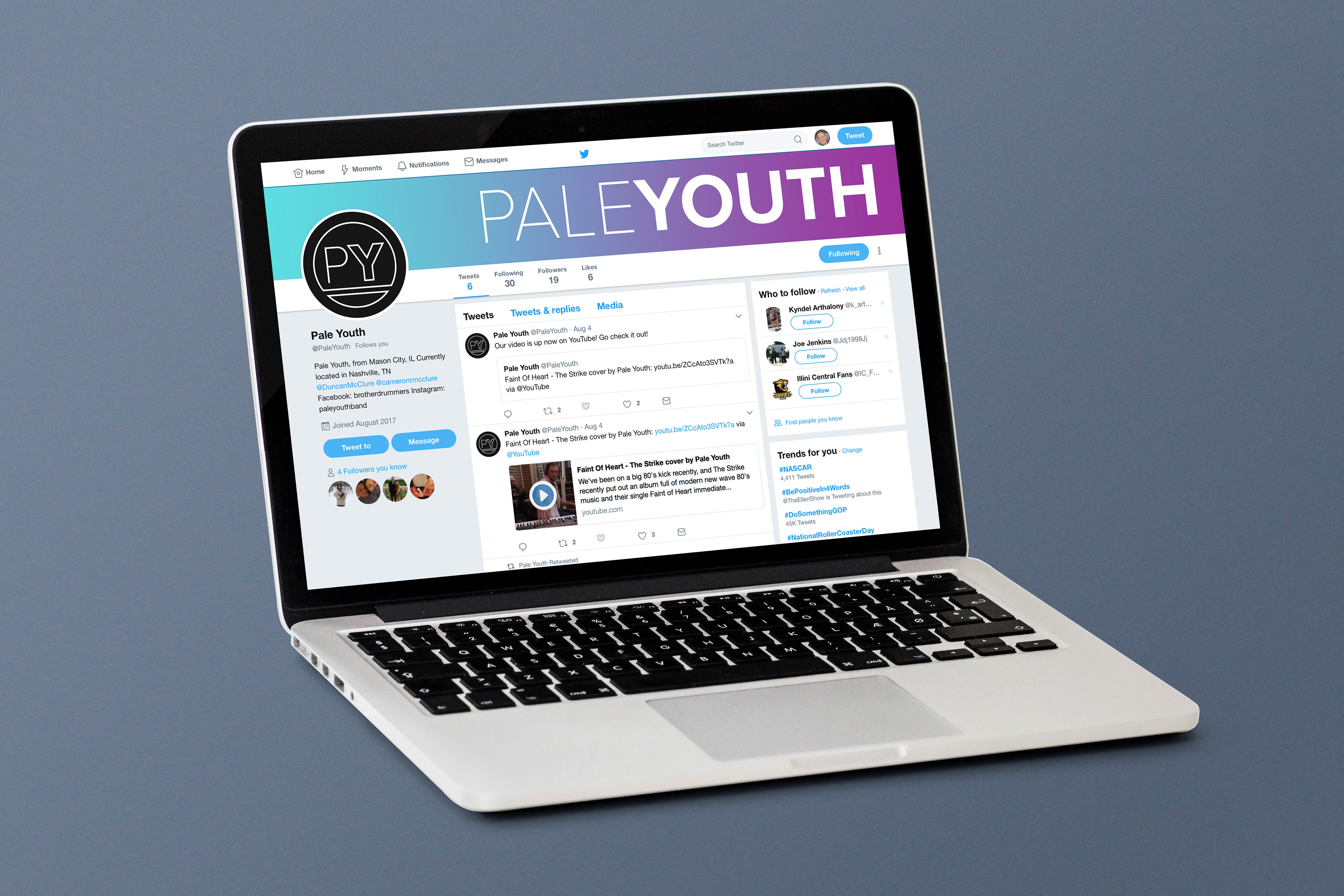
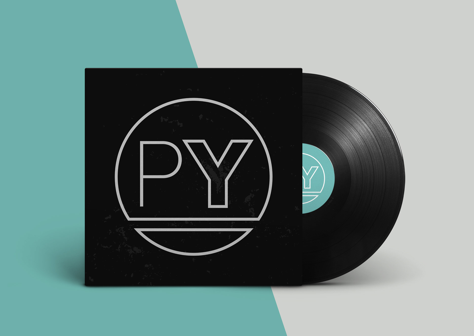
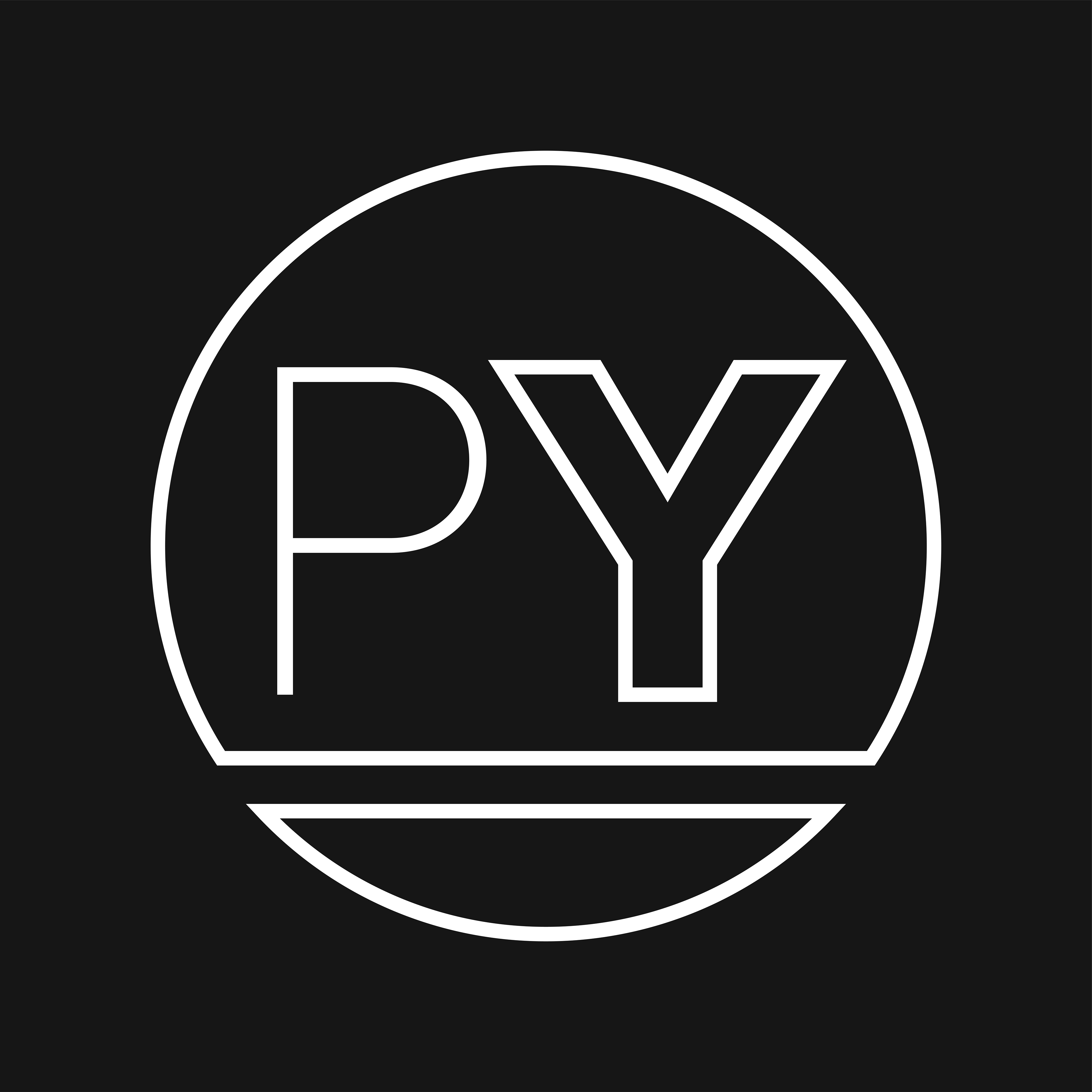
This brand involved a long process to develop. First, I began with sketching out different thumbnails of simple icons that work well for the band and would look great on an album, as well as on social media, since these will be the logo's primary home. I decided to stick with a clean font, Proxima Nova, to get the modern and clean feel that the band members were looking for. When it came to making the logo feel more "80's," I was stumped. They wanted it modern, but also retro. Two conflicting ideas. I knew I didn't want to change the structure of the logo at this point, because we were all very happy with where it was at. And it hit me. The color palette. It is very easy to shape the feel of a brand with the colors you choose, so I knew I had to go with something neon. And nothing screams 80's like blue and pink. The logo is very versatile so it also works well in black and white, but it thrives in neon.